I have shown my animation to friends and family, and an opinion which keeps coming up is that, while the attention should be on the dancers, there needs to be a background for my video, as it looks very basic and unfinished with a plain white background.
Some suggestions were very unrealistic, such as hand-drawing a background for each frame. This would double the workload, and, even though it would look great, I won't have enough time to create something worth watching.
However, a suggestion which I really liked was making a static film of the sky, over a couple of hours, and fast-forward it so the clouds move faster.
This background would look good, and at the same time be subtle enough to work with the animation.
I could also change the light, saturation, or add a filter for a greater effect!
I found a clip on YouTube which shows more or less what I am aiming to achieve (but mine will be better):
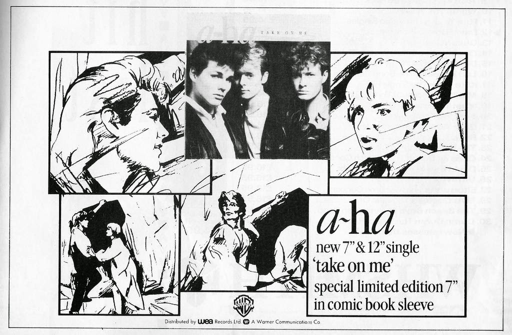
My magazine advert initially was going to be based on the above album cover, Only By The Night, by the Kings of Leon. I like this particular advert because the layout is simple, but the image is a montage of two photos, an owl and the singer.
I thought a collage like this, of my dancers and my hand-drawn frames, would both follow the conventions of my video, and engage the attention of the viewers, which would increase the chances of my album being bought.
However, once I changed my mind about having half of my video be the original footage, and half be my drawings, it stopped making sense to have a collage of the two images on my magazine advertisement.
This advert is for the single Love Is Noise by The Verve, and I like it because it is not conventional, in the sense that the image does not include the artist/band, or any instruments, or anything to do with music, for that matter.
My video is a hand-drawn animation, but the background will be a fast-forward shot of the sky and clouds, so an ancillary text like this one would be consistent with the rest of my work. I also think that something that doesn't necessarily have to do with animation or drawings would be a refreshing change...
As you can tell, I have cut the end of the video, where I show the camera my work. I had to do this due to the brightness of the screen; my camera did not capture any of the images.
However, I will be uploading the latest version of the animation soon.
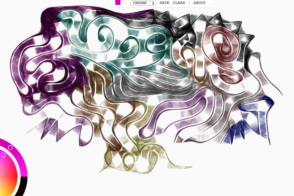
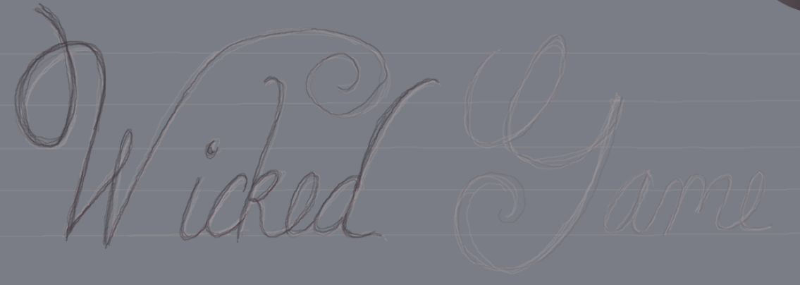
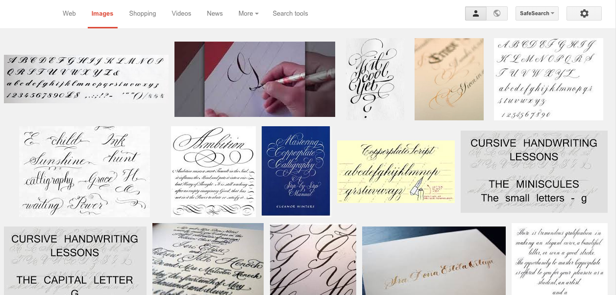
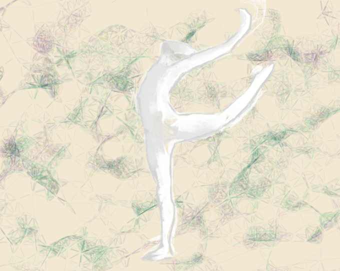
Working on the front cover for my album's CD case - which ended up being my magazine advertisement - was a lot of fun, as I discovered a program called Harmony, created by 'Mr Doob'. The program works by connecting the lines which one draws with smaller lines; this is called a neighbouring lines concept: the program takes simple vector-based imputs (the drawing), and creates its own drawing on top, using a series of numbers (I think at random) which determine how the lines will pan out.
The program has different features;
'Simple' is a basic 'pencil' tool, and doesn't make any connections (much like the pencil tool on the Windows program 'Paint'). I used this to create the basic shape of my figures, as using any other tool made it impossible to draw two lines next to each other without them being connected automatically by the program.
'Sketchy' lets the user draw lines, and connects those which are next to each other (as the drawing is being made) with straight lines. The connecting lines are very dark when the drawn lines are close to each other, but become thinner and eventually stop connecting as the lines which are being drawn grow apart.
I have created a series of doodles with this tool to demonstrate how this looks (because the above description is confusing):
'Chrome' seems to be same variation of the neighbouring lines concept as the 'sketchy' tool: the connecting lines look the same, but this tool creates the lines with different hues of whichever colour the user chooses to draw in.
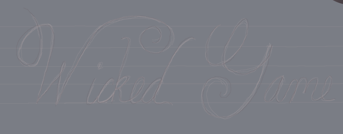
The tool was used in my previous attempts at creating my ancillary texts; however, in my final product I decided to use only greys, black and white, as it follows more closely the conventions of my music video.

.jpeg)